Groundnut Font
by John K. Barrow
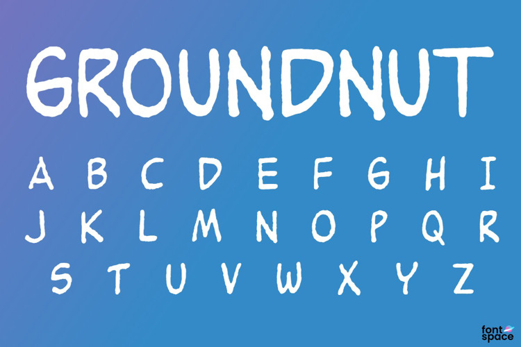
Regular Style

Designed by
About Groundnut Font
Aestheticware‐‐‐If you use this font or even just like it, you MUST do something to make the world look a little better. Violators will be shot‐‐‐Based on the friendly handwriting of Charles "Sparky" Schulz ‐‐ Alternate characters included
Related Styles
Comments

Could use a few more characters but I still like it 😄

Very cute! I also have to admit that I love your terms for commercial use (I also had a good laugh at it, lol) 😃 Thank you for creating and sharing this font.

As I said of the previous version of this font, it would be more useful with numbers, extended Latin letters (especially umlauted vowels and a versal eszett, given Schulz's German heritage) and more punctuation.

Just what I was looking for. Thank you! (Always trying to make the world better!)
Just like the preview above, I often have several letters "clump" over each other, which often makes this font impossible to use. I was hopeful, but unable to fix it. Anyone know how to fix/avoid this problem?

Please fix the font! This font is buggy!

There is a bug in the "character width" or "kerning hints" for the lowercase letter K. After hitting k followed by any other letter (but not punctuation) the position jumps back several characters. Is there a font debugging tool I could use to patch this?
Note: work-around: since this font is all small-caps anyway just use a capital K instead of a lower K.
I fixed the font by redefining the lower case K glyph. Get a copy here https://github.com/PeterTheobald/goundnut-font-fixed

Thanks for the beautiful work! You might like to know that people sell this on Etsy for $2
Excellent for comics! THX a million 😉