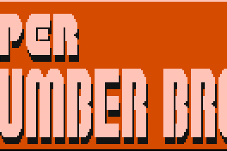
Super Plumber Brothers Font
Designed by
About Super Plumber Brothers Font
Super Plumber Brothers Font is a Super Mario Bros font and was created on . Since then, it has been downloaded 213,389 times and added to 949 collections. 111 people have liked Super Plumber Brothers Font and given it a thumbs up.
Super Plumber Brothers Font was recently updated on Mar 16, 2010
Regular Style

More info from Jackster Productions
Replica font of the Super Mario Bros. logo used in the title screen. Point size is 40.
License Info
Related Styles
Comments

Am looking for this even!!!!!!!!!!!!!!!!!!!!!!!!!!!!!!!!!!!!!!!!

I was looking 4 this!
Awesome! I luv Mario.
guys at friday am watching HOP!
for real! am not watching it for fake!
am watching it for real! dont lie say
the
truth!

Cool!

Best thing i have seen since 1987!

LOLOLOOLOL
No i aint spammin.
Itsa me! Scrat- *gets punched in the face* Mario!
Cool

This is the best font I have seen in a long time 😉

@Blossom463 I Agree

This font is too tall.
Theres so many things wrong with this. First of all, there's no shading like in the original, second of all, the capital "G" doesn't look like a "G" because it looks like a "C", 3rd of all, it makes you have to find the color of the text in the original logo yourself.

do the mario! swing your arms from side to side come on its time to go do the mario! take one step and then again, lets do the mario all together now!

It looks more than Super Mario Bros Plumbing!

So cool!!!

I've been looking for this!!!